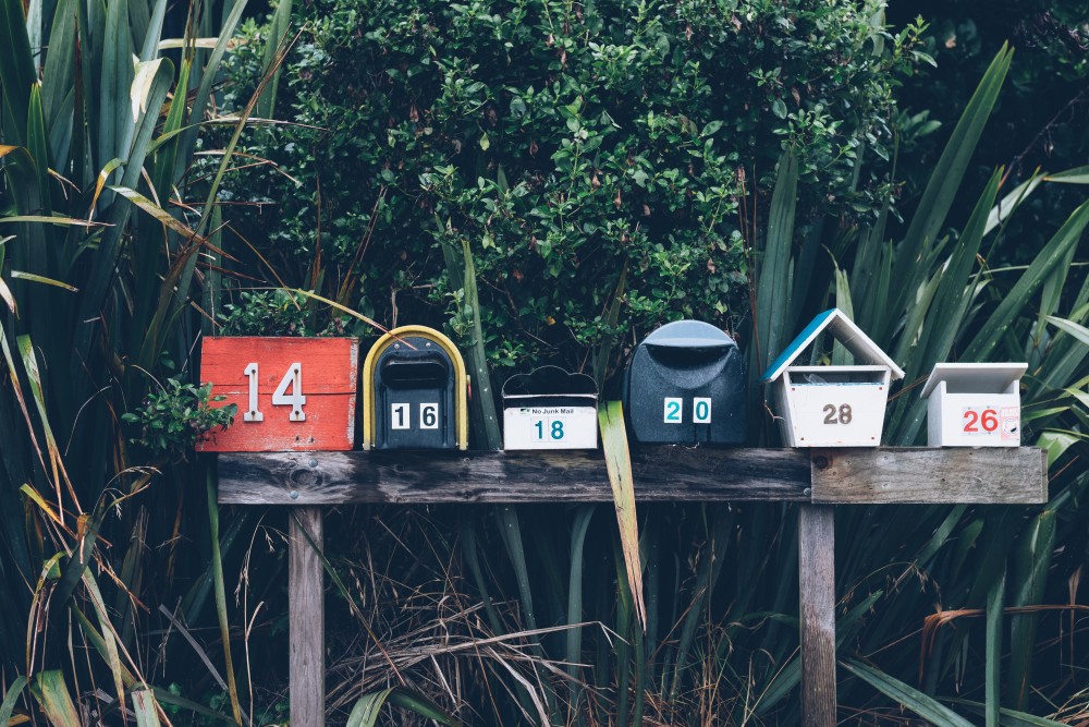
 Photo courtesy of Betsy Weber: http://www.flickr.com/photos/betsyweber/
A while back I wrote a post titled, “What makes a good newsletter?” …but there was little talk about what makes a good audience and how you can get them to open your newsletter in the first place. Here is a prequel, if you will, to that popular post:
1. Same objective, different content.
Recently, I realized that I had my big brand folks tied into the same newsletter as my startups. What made me think that the same content would be relevent to both? It was an ah-ha moment that I regreted not having sooner.
The remedy? Creating seperate lists, with seperate campaigns, communicating the same objective in a way that makes sence to very different business structres.
For example, If we wanted to promote our membership program to our startups, we’d focus on “bang for your buck” with testimonials of how other small businesses make it work for them. If we wanted to promote the SAME membership program to our big brand clients, we’d focus on project seamlessness and quality of work with portfolio-style images.
2. subject lines that blow minds.
We all know how important subject lines are, but what’s the secret to getting it right? Here’s my best advice:
First, look at the open rates of previous e-newsletters. Which nesletters had more opens than others? What was the subject line? Did any of them have drastically larger open rates? This will give you good clues on what your audience responds to.
Second, keep it short. The shorter, the better… as long as it’s still relevent.
Third, be different. Think about the subject lines that fill your inbox daily and give you that slimy, spammy feeling. You don’t want to sound like spam! Nobody likes spam. I bet spammers don’t even like spam. Coming up with a non-spammy subject line is actually hard for us because we’re programed to fit in, but good marketing doesn’t fit in! Instead, write out what you want people to know about your newsletter and brainstrom fun, easy, short, interesting ways to say it.
3. Tailored design.
Of course the design shold reflect who you are as a company, matching the branding of your website and other main-stream marketing materials, but there’s still room for creativity. Your e-newsletter design should reflect the taste and culture of your audience types in a subtle manner that makes them feel like they can connect with the content. That, my friends, is where the magic happens. After all, it’s all about getting your content in the minds and on the mouths of others.
For more info on how to build great newsletter content, read What makes a good newsletter?
For more info on how we can help you create an awesome e-newsletter get in touch by using the form at the bottom of this page. Cheers!

