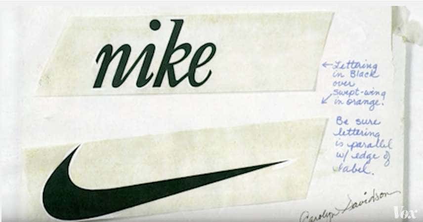
While your logo is an important part of your brand, it is not meant to carry the entire weight of your brand. Your logo is an empty vessel that people can associate with your brand but the value comes with how people experience and interact with your brand.
Take the Nike logo. The only reason people associate this chubby check mark with athletic achievement is beause of a visual marketing strategy that features rolific athletes and exciting customer experiences, all of whom are wearing Nike products while engaged in activity. Without those things the logo has no meaning.
That doesn’t mean every logo is a good logo. There are certain aspects that make a logo well designed. A well-designed logo will make it much easier for you to communicate your brand message and vision. Certain factors such as balance, negative space, typography, and color (just to name a few) are important when it comes to crafting a well-deigned logo.
[Tweet “A well-designed logo will make it much easier for you to communicate your brand message and vision.”]Whether you are selling soap or baking cookies, it is important that your logo helps convey the right message. If you are selling cookies, you don’t want your logo to look like you sell industrial chemicals. But, you also don’t want to blend in with every other soap logo. Striking a balance between being unique enough to stand out and appearing appropriate to fit into your industry is important.
To achieve this, I recommend working with a designer who can both understand your point of view while also guiding the process to keep in line with best practices and maintaining usability for any possible placement of the logo design.
The process of developing your logo should be a team effort between the client as the essence, and the designer as the guide.
Have anything to add to this post? Tell us in the comments.


