First ask yourself this: The last time you visited a website with sound or music that started playing instantly, what did you do?
Did you fluster between the page and iTunes, become startled, close the page all together so your boss wouldn’t catch you, or was it freaking awesome?!
We get it. You want to make your website an expeeeeeeeeeeerrrrrience, but that doen’t mean you need to overload all the senses.
A website can be an even better experience with this quick checklist:
1. Interactive design. A cause-and-effect reaction that happens all on the same page to make content easier to find and more fun to view.
2. User experience. This means you have an action plan for the viewer and the website is designed to achieve that plan.
It’s somewhat of a science based on drawing the eye from one location to the next and provoking action based on what that type of viewer is there to do.
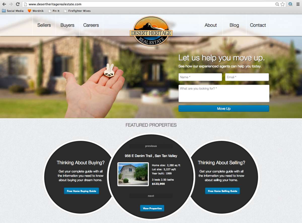
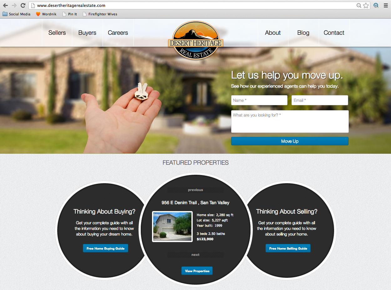
Notice where your eyes are drawn here… brand recognition, feelings, actions.
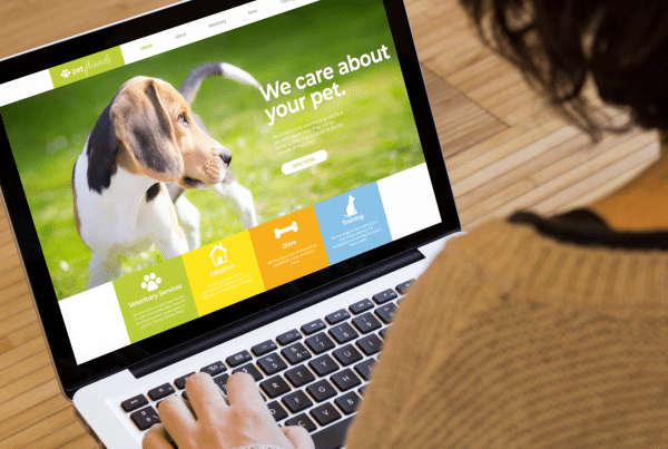
3. Content that begs to be heard. You probably already know that people dont’ read anymore… they skim. You’ve probably only read half of what I’ve written above, but you’ve seen all them images and perhaps even read the content within the images.
Not only do people need short content they need pretty content. This includes consistent header and paragraph fonts that are ideal for your message, awesomely designed placement and snappy verbiage. The way your company “talks” is up to you, but get to the point and make it look like you mean it.


