It’s an art that revolves around five best practices. Here they are in no particular order:
1. Organized content
Understand what exactly your viewers are looking for – This can be achieved by checking out your analytics. Also, what important thing do you want them to know about that they’re missing? Finally, understand many repeat visitors know exactly how and where to find what they’re looking for. It’s important to catch first timers with really crisp home page content.
2. Interactive content
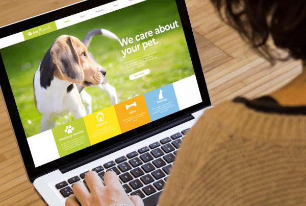
We know by now that people don’t read anymore, they skim. That’s why interactive content is so important. It makes viewers want to read because it’s fun. Interactive components could include sliders, hover actions that reveal more content or call-to-actions that visually tell the story of your service or product.
3. Beauty images
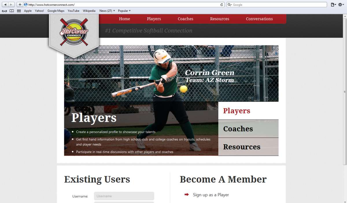
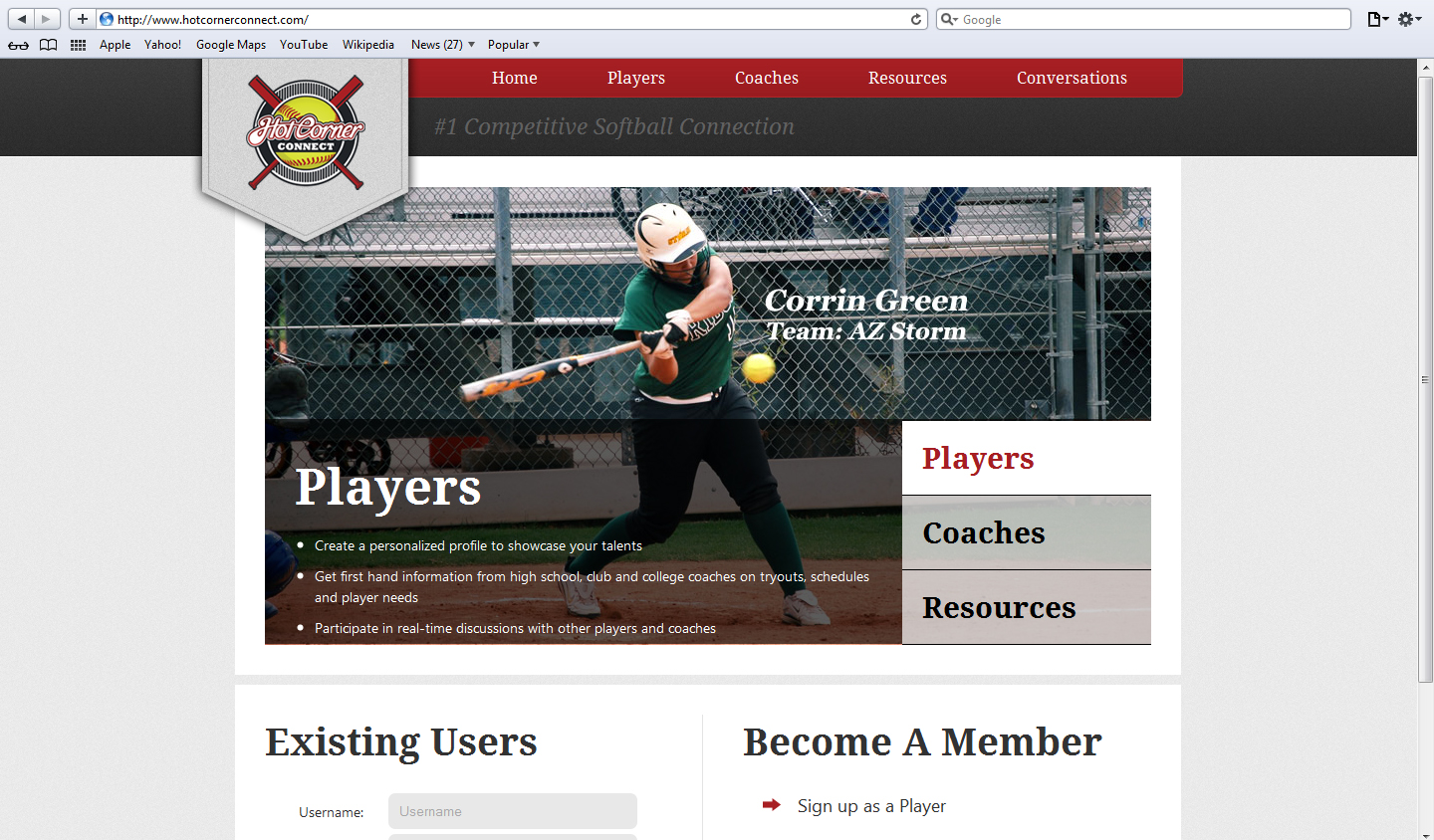
Impressive photography is a worth investment. Like I said before, people don’t read. In fact, before they even skim, they are going to look at the pictures. Beautiful and interesting pictures make people want to know more because they’ve made a connection with your company they wouldn’t have otherwise. Plus, good images compliment content which increases understanding.
4. Short and snappy copy
Third time is a charm… People don’t read. Conversational or direct copy is imperative to getting your message across. If there’s too many words, the viewer will get overwhelmed and go elsewhere.
5. Inspirational design that speaks to the customer
Design should provide an experience for the viewer. What that experience is like is what your customer will conclude your company as a whole is like. It’s important to get it right. Think of it this way… what is the feeling I want to evoke from my customer when they interact with my business? Your designer should be able to guide you through the rest.


