
I just can’t jump into the secret sauce before a little talk about the main ingredients.
The homepage should not be underestimated. BUT, that doesn’t mean you should overdo it. Too much content is scary.
Research has shown that people only take THREE seconds to find what they want on a page before clicking away. That means you can’t get too wordy or flashy. It’s important not to distract viewers from moving through your website while simultaneously maintaining their attention.
If you’re a pro at being brief, you’re ready for the special sauce. There are two main ways to initiate a conversion on your website.
FUNNELS
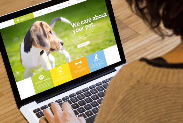
These are very effective if you have been able to dissect your target audience into categories, niches or needs. Based on what people most often come to you for, you can create sections on your homepage just for them.
This could include sections with photos, titles and brief descriptions so the viewer can easily determine what click path to take depending on what their needs are.
These funnels should not take visitors on an exhausting journey through multiple pages, but rather land them right where they need to be with organized information and the ability to get help or make a purchase right there on the page. That’s what we call a conversion.
CTAs (CALL-TO-ACTIONS)
Call to actions don’t have to be saved for your landing pages. If people are referred to you (which would be a hot lead), they’ll land on your homepage. People will also land on your homepage if they are already a customer or plan to be.
Both of these audience types are your bread and butter and they are ready to convert with a little nudge.
If you’re a brick-and-mortar business like a shop, medical office, or restaurant, you should have a map and location information findable within a quick scroll. Then, help your audience out a little more with a clickable phone number or directions.
For the rest of us, contact options should be a must for the header/footer… including social media links if you’re active in that space. If you don’t post on social media, don’t disappoint with a link to bad or outdated content.
If you are offering a promotion or launch, this should be front and center with a LEARN MORE button that takes people to a landing page where you can complete your offer and make a sale. This particular type of call-to-action is great as an added header or popup.
But here’s a quick tip about pop-ups. Google doesn’t like big ones! (And neither does anyone else.) Keep them bright, brief and easily gone.
We actually help clients create small corner pop-ups that grab attention and can even be customized based on how many times that person has visited a particular page or what list they belong to. Crazy how high-tech those little pop-ups have become!


