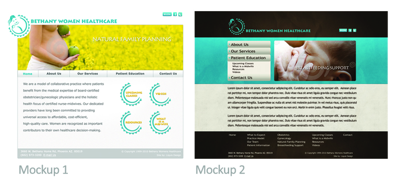
Only one design lives.
Client: Bethany Womens Healthcare

We recently finished a website for Bethany Womens Healthcare. As you can tell, they chose Mockup 1.
“I think we chose the mockup because it had such a ‘fresh’ look. We had such a drab-boring look to our old site,” said Lylaine Gavette of Bethany Womens Healthcare. “This one offered a bright, sunny, cheerful look. It just invited one to look into the site more deeply.”
When we started the process, we discovered exactly what the client didn’t like about their old site, which is always an important step in discovering the new direction and feel. We also probed for new descriptives and desired company perceptions to build on a new vision. Upon creating these two distinct looks, the client quickly choose Mockup 1 as the winner with absolutely no revisions to the design.


